
Tableau: Year Over Year Metrics Comparison

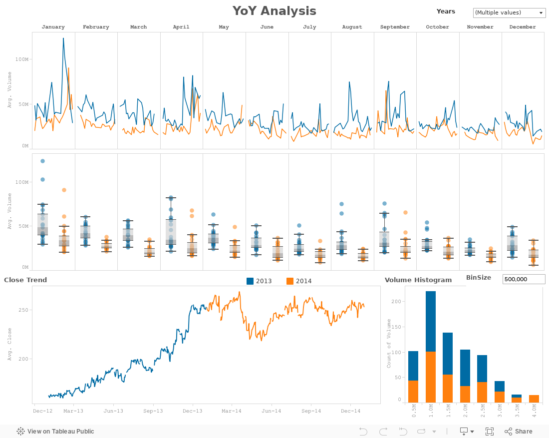
Created a Tableau Viz using the OOTB Data Set to do a Yea over Year metric comparison, where the two years to be compared are user interactive choice. Incorporates the following features:
1. Trend Charts YoY using color marks at a Monthly granularity
2. Box and Whisker Viz with YoY using color marks at a Monthly granularity
3. Trend and
4. Histogram YoY using color


Comments

Popular posts from this blog

Retail: Shipping Time Analysis using Tableau

This report is based on the calculated field called Shipping Time, where 'Time to Ship' formula is as below: The two charts 'Ship Time by Year' and 'Ship Time by Month' are a Filled Area map of the - Number of Orders (Y Axis) - Days to Ship (X Axis) Colored By - Year - Months The 'Timely Shipment' chart is colored by whether 'Ship Mode' is 'Early', 'On-Time' or 'Late' Based on a business Logic per formula below: The report below is interactive using Dashboard Action filters.  Uses OOTB retail data that comes with Tableau installer.

Tableau IronViz Feeder Contest for TC 2018: Water

Friends, built this Viz on top of Great Lakes water data from NOAA site. The submission has been made for round 3 of the IronViz feeder contest leading to #TC18 . This Viz is published to Tableau Public  and embedded to this blog

Tableau Dynamic Parameter Reports

Find the example using SuperStore data published to Tableau Public to showcase use of  - Parameters to Sort and  - Dashboard Actions